Great, but so what?
When you look back to the Instagram example above, it is clear that the UI overhaul was done in order to emphasise the core functionality of the app. Instagram have made it easier for people to do what they come to the app for: to share their photos with the world.
However, it’s also clear that many products have begun to look the same. Are they following this trend simply because it is a trend? If so, that’s understandable - after all, to continue the Instagram example, it is a highly successful product. In the UK, 14 million people use Instagram, with a large majority of those people being 35 or under - so if you need a new product to engage millenials, then you might naturally look to Instagram as design inspiration.
As a designer, it also reminds me of days gone by, when a UX designer or product owner might hand a set of wireframes to a UI designer, with the instructions to simply ‘make it look good’. In those cases, with a deadline looming, it’s not uncommon for the UI designer to just copy popular, trend-based interfaces. This ‘over the fence’ method is not only inefficient for both the UI and UX designers - it runs the risk of getting it badly wrong.
Today, the lines between UX and UI design are blurring, and the design process is more integrated than ever before. For your product to stand out, the experience has to be exceptional - your audience has more choice, and higher expectations, than ever before. That means superficially making it look good is not enough - nowhere near, in fact.
This is the exact reason that we don’t have UX or UI designers at Kin + Carta Create. Instead, we have product designers. This group is encouraged to embrace every product holistically. It is also the same reason we like to get designers involved in the process as early as possible - because an ‘over the fence’ approach cannot coexist with great product design.
For more info on how our design process works, check out this blog from our Head of Design. Below are three key steps we use at the beginning of every project that helps us to keep focused on:
1. Define the problem
Product design always solves a problem, and understanding the problem thoroughly is essential to this process. When discussing the product and its design internally, make sure to define the problem first before proposing solutions. Thorough research at this stage will always help a team come up with better solutions.
2. Be consistent
Consistency is key, so ensure you bring it into every single element you use in order to reduce the cognitive load for the user. When designing a set of interactions for a product, a consistent user experience will identify the product brand to anyone.
3. Use human language
Words can both clarify and confuse. Speak the same language as your users and try not to overload them. Be helpful and provide them with the info they need - and then get out of the way. It is important that you help them achieve their desired outcome first, and add personality to your designs after.
So, should I go minimal?
The answer is - it depends.
Rather than focusing on a design style you think is nice, or ‘on trend’, you should instead question whether the design really helps people achieve their desired outcomes. At the same time, you need to ensure that the brand, the personality and visual identity of the product, shines through.
A brand is much more than logos or colour palettes. It also relates to how a person feels when using your product, including their perceptions and the context they are in. This is why the brand must be experienced within the product - and any interface trends must come second, if at all.
Before you automatically go towards, or against, the current preference for a minimalistic approach, consider the examples below:
Put desired outcomes first
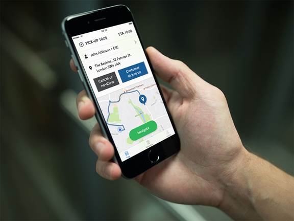
When we built the Dial-A-Ride app for TfL, we did a great deal of user research to understand exactly what the core user group were trying to achieve.
It’s a world away from the UI of ‘on-trend’ products, but that’s ok. It’s built for Dial-a-Ride bus drivers, and its purpose is to help them move London’s most vulnerable residents easily and efficiently from A to B.
Our research with these drivers uncovered two key facts: one is that they are not familiar with the latest technologies and smartphones, and the second is that they are often on a tight schedule. The app’s job is to get them on the road as quickly as possible, heading to the right pick up. This meant that a fashionable, minimal UI would not have been beneficial to them.
Instead, they wanted a simple and straight-forward way to get things done. That’s why, upon opening it, the app’s big, colourful call-to-action buttons take precedence - allowing the bus drivers to access the information they need quickly.