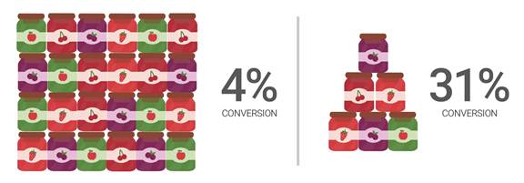
1. Hide your less popular choices
It might seem counter-intuitive. You want to show everything to everyone at the same time. It doesn’t feel right to relegate some products to another page. But it will increase sales.
Show the things you know are popular, and then make it easier for the user to explore other options in more depth. Have an expand button or simply ‘See more options’. For every option you remove, the rest become more prominent and are more likely to sell.
For example, our client Lexus has a large number of models and grades of cars. Rather than showing all variants to the customer, we initially display the primary models. This allows customers to then dig deeper should they wish
2. Give them a nudge
This requires ‘choice architecture’, where you decide what to show and how – considering the layout, sequence, range and design – to help customers make decisions and overcome analysis paralysis. It uses the principles of Nudge Marketing: influencing decisions indirectly through suggestion and reinforcement.
Motivations such as loss aversion, fear of missing out and association can help shape behaviour. There’s nothing underhand about this, but rather it’s allowing people to make simpler decisions by making some choices easier than others.
For instance, working with LNER we simplified the ticket buying process and included information - such as seats remaining - to help people make their ticket choice. It was a light nudge but also a useful pointer.
3. Make suggestions
Why not create a user journey where the customer tells you what they're looking for? That means you can direct them to the right product or a much more limited range of choices. Ask them: ‘What kind of socks are you looking for?’ or ‘Which colour would you like to wear?’. It will save users time and make them feel like they’re choosing a product based on logic.
4. Avoid information overload
Too much information can further pack your customer’s brain with confusion. Our short term memory holds only seven items and just one more can make a big difference. Try and limit your page navigation to five items so visitors are less likely to miss important links.
If you're describing your products then keep it simple and highlight the salient facts. It should be easy at a glance to see what the benefit of buying might be. If you really want to provide a 200 word description of your socks then make that an option for those who are genuinely interested.
In summary, keep it simple.