
Select your location

Visualize Understand Act

Visualize, Understand and Act: 5 Tenets for Visualizing Data to Compel Critical Actions in a Crisis

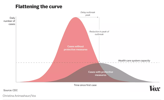
"Flatten the Curve."

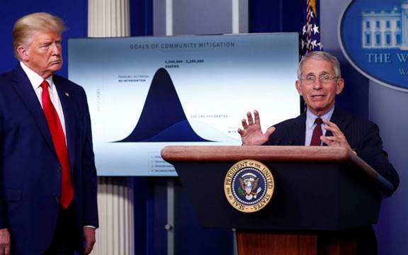
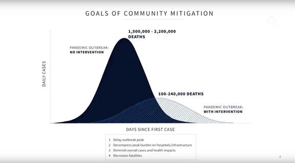
Those three words summarize an international mandate that has become the rallying cry for how the world makes sense of–and responds to–a global crisis that will define our generation. And it’s based on a chart. A data visualization. The sort of thing previously relegated to Powerpoint slides, scientific journals and the occasional social media “infographic” is now helping quickly establish global understanding and shape policy in a crisis.

A massively complicated, messy, unpredictable, confusing and fast-moving challenge was visualized in a chart that was beautifully simple and clear in its message: “The first curve is what happens if we don’t take the right action. The second curve is what happens if we do.”

Flattening the curve
"Flatten the Curve" graphic via the CDC by way of Vox

The continuous onslaught of attention-getting charts and graphs disseminated online and through social media portrays so many facets of the health crisis and the economic crisis we’re all grappling with. Whether it’s mapping outbreaks across the globe or in our communities, charting market volatility, or seeing unprecedented economic impact laid out by industries, it’s clear we’re in uncharted territory where the standard decision making logic isn’t enough. We need tools that help us understand what to do, and those tools need to be well designed.

As we all manage through the crisis and navigate our own personal and business decision-making, there are important lessons we can learn from the way data visualization enables better decision-making in times of crisis. From quickly accessing the right, credible data about how our businesses are being impacted, to representing and comparing scenarios that enable confident decisions, how we visualize and understand the data is critical to how we decide and act.

Consider this report from Kevin Liptak of CNN, which suggests that in the U.S., decisions being made at the highest levels regarding policies on how we proceed are being led by doctors who operate with the following principle for influencing their decision-maker-in-chief: “Bring visual aids.”

Anthony Fauci
U.S. President Donald Trump listens to Dr. Anthony Fauci, director of the National Institute of Allergy and Infectious Disease, as they stand in front of a chart (source:WJBF.com)
Goals of Community Mitigation
White House Data Visualization: "Goals of Community Mitigation" (source: mediaite.com)

How do you design for influence in a time of crisis? Here are five tenets for designing data visualizations that tell clear and compelling stories for decision-makers, whether that decision-maker is you, or a leader within your organization.

Start with Credible Data

This may sound obvious, but it might prove harder than it sounds to ensure that you have the right data on hand to inform the situation and that the data is accurate. When reviewing a dashboard or visualization, one of the most common reactions an informed viewer has is “where is this data coming from, and do I trust it?” If the answer is unclear, then everything else falls apart. Whether using data from within your organization or an external source, make sure that it is reliable and accurate to maintain credibility. A crisis is a tough time to realize you don’t have access to the right information, but the effort to source critical and reliable data is worth the effort. Where you have gaps, consider proxy metrics that can provide directional insight, in place of the perfect data set. The key is using data that is reliable enough to help inform decisions.

Be Ready to Move at the Speed of Crisis

Critical decisions don’t wait for set-up time. Consider what tools you use in creating the data visualization based on how easy and fast it is to set up. There are myriad options. Tools like Tableau and Google Data Studio provide some robust options for visualization and allow you to hook up a variety of data sources, but sometimes a good old presentation slide suffices to get an idea across quickly. Consider the immediate, short term, and longer-term needs during set up.

Also consider how to make the data visualizations extremely easy to access. Whether you’re creating a single graphic to inform a decision, or creating a full dashboard for monitoring mission-critical indicators, you’ll need to anticipate where it will live, how will it be accessed without friction, whether it is mobile device ready, and how easy is it is to share with others.

Design for Clarity & Simplicity

To be effective, the objective of data visualization is to make large volumes of complex data quickly understandable. There is a balancing act between providing enough detail to be understood, and providing too much information that could complicate or confuse. In times of crisis, the cost of confusion is higher than ever. Consider what information is necessary to inform the situation, and reduce or eliminate unnecessary information in the visualization. Reducing the extraneous information, whether it be things like an extra axis or unnecessary labels, reduces the cognitive load (or mental energy) needed for a person to process and understand. And don’t overlook the value of clear labeling: terminology, jargon, lingo and obtuse acronyms are a common pitfall. Use succinct, easy to understand language to identify information in the visualization.

Want to know if you’ve struck the right balance between enough information and not creating confusion? Show the visualization to an expert to verify it’s accurate, and a layman to verify if it’s understandable, and get their input on how to improve it.

Ensure Usability & Interactivity

Data visualization can be thought of in two categories: “Flat” or static visualizations vs. “Dimensional” or interactive visualizations. A static visualization is one that is not meant to be adjustable but provides a clear, singular snapshot of data. Interactive visualizations are those that allow a user to adjust variables in the data. Both can be informative and impactful, but there are richer long-term benefits to dimensional or interactive tools over static visualizations. Mainly that by allowing for interactivity, you’re inviting the user to explore options, consider various scenarios, or zoom in to more specific data sets to better inform their decision-making. Ensuring that the data you’re visualizing is more than just viewable but usable and interactive in real-time helps to provide a more confident and empowered decision-maker.

Design Towards a Decision

If the goal of data visualization tools is to enable better, faster decision-making, it’s important to be clear what decision it is you want the user to be able to make from the outset of the design process. Are they making a choice, or just checking progress? Is there a comparison needed, or is there one indicator that matters? Is there a need for urgency? Consider how the design might clarify those things. Keep the critical decision in mind as you design the right visualization that empowers it. Remember: it’s not the job of data visualization to decide for the user. It is the job of good data visualization to enable users to make well-informed decisions and take action.

Implications for Businesses

How do these guidelines help as we navigate our businesses through a crisis? Whether you have existing dashboards and reporting tools that you use, or you’ve been thrown into a crisis to realize that you’re not well-equipped with the tools you need, the suggestions above can help you assess or prepare for success. As the world turns upside down around you, do you have the data you need, set up and visualized in the right way to rapidly create the understanding that compels action? Do you have the tools to efficiently scenario plan and see a path forward?

Taking the right approach to data visualization can be the difference between clarity and confidence, or ambiguity and anxiety. Well designed visualization tools help you and your organization see beyond the volatility to make decisions and take the actions necessary to navigate a crisis.